← Back to all essays | Author's essays Design considerations for our new library
by CriticalResist
Published: 2023-10-01 (last update: 2023-10-02)
15-30 minutes
In this essay, I want to go into the considerations and challenges around the redesign surrounding our library and compare it to a very well-known library in marxist circles, the Marxists Internet Archive.
I hope it will provide comrades with valuable insight into how to conduct projects from a design perspective, whether for their party, agitprop work, or even their personal hobbies.
Read more

On a day like any other of July 2023, ProleWiki archived its old library and made way to an entirely new, redesigned from the ground up, library.
In this essay, I want to go into the considerations and challenges around the redesign surrounding our library and compare it to a very well-known library in marxist circles, the Marxists Internet Archive.
I hope it will provide comrades with valuable insight into how they could conduct projects from a design perspective, whether for their party, agitprop work, or even their personal hobbies.
Our old library, frankly, was a mess. Not only did editors need to add works to the library in the first place (an obvious step), they then needed to edit the old library page and manually add the book somewhere on the page. Where exactly, though? Nobody was sure. We had some general ideas for a hierarchy but the more works we added, the more the page got chaotic. And the more it got chaotic, the less people wanted to upload books if it meant having to trudge through a never-ending list of books all collected on a single page.
Over several months, we asked ourselves what we could do to help this library page. We figured it wasn't great for the readers either, and in fact a survey we ran showed that most people, when asked to find a specific book on the old page, used the table of contents (as seen on the right in the screenshot) to find the author, and then the book.
My personal design principle is that if people are not using a feature, then it has no reason to exist. Since readers were almost exclusively using the table of contents instead of the page itself (not that this page was searchable or browsable without the table of contents), this meant we could essentially remove the entire catalogue of books and authors and instead offer only the table of content and get the exact same survey results.
Our old library had served us for three years, but it had been started back in our earliest days as sort of a temporary page to showcase the books we hosted and grew as it pleased from there. Clearly, a complete redesign was the only solution.
“ The more our old library page got chaotic, the less editors wanted to add works to the library.
Setting out to redesign
Gathering the survey data
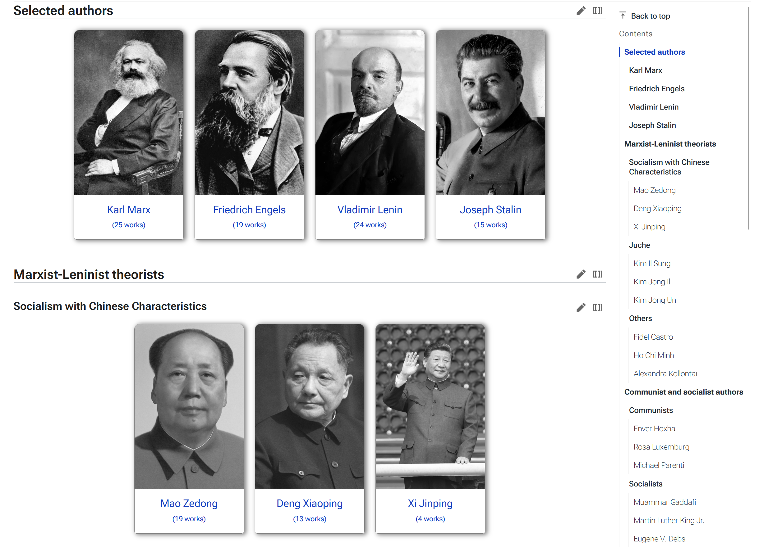
In the survey that we ran about the library, we also proposed a mockup (a static image that shows what a page will look like when it's made. The mockup is faster to make than the image and helps visualize if a concept works or not) for what would eventually become our current library. The cards system (where authors and topics each have their own card and associated picture) was already in place, albeit looking just a little different. This was a resounding success: 90% of respondents rated this proposal as a 4 or 5 out of 5 over the "current" (now the archived) library. In the comments, we saw that people enjoyed the organization and categorization of authors, putting faces to names, making navigation easier through larger icons, and essentially improving intuitiveness.
Adding large pictures above each author was not only done for aesthetic purposes; this was actually a User Experience (UX) choice. People recognize pictures sometimes faster than they recognize words (depends on the picture, depends on the word). Combining both media would essentially allow readers to browse our library the way they prefer: by scanning for words, or by scanning for images.
Categorizing authors (introducing bias)
Our second choice was to categorize (and organize) our authors. Most online libraries, we found, simply link authors by alphabetical orders, refusing (for one reason or another, which we are not saying is not valid) to apply hierarchy and pick and choose between different authors.
This has some benefits, but it also has drawbacks. A major one is that it makes discoverability harder.
Think of this case: you want to read about Chinese socialism, but you don't really know any Chinese socialists aside from Mao. In a library organized in alphabetical order, you would never be able to find a Chinese author -- especially one that wrote about Socialism with Chinese characteristics. You could scroll past Deng Xiaoping's name and never click on him, despite him being one of the big theorists of SWCC!
Thus in such libraries people rely on other means to find the works they're interested in: either they know who they're looking for, or they go on Google (or other search engine of choice) and type keywords.
The first case is not part of this usecase (a specific task or process arising from normal usage of a service -- in this case, someone looking for works without knowing exactly which author or what book they're looking for). The second case is a missed opportunity: readers might never find the book they were looking for if they search on Google, instead finding the drivel that modern search engines are known for pushing to the top.
Run this test yourself. Go on this index page for marxists.org. Then, find the Guerilla marxism section without using ctrl+f on your keyboard or any other tool not offered by the MIA website itself. How long did it take you?
Marxists.org is a cult website. Although we dislike how they edit entire parts they don't like out of books (and they have admitted to it themselves), they do provide a vital service, introducing many people to Marxist literature for free. They have arguably the biggest online collection of marxist works too. But the website's age shows, and we'll be going into this again in this essay. The main method people browse marxists.org is not by using the website as intended (clicking on the main page picture then finding an author): let's be honest, people use Google to browse marxists.org or, more specifically, to find the book they want to read. Good luck finding anything that is not a book on the MIA.
In any case, categorization was another big consideration when making our new library page. We decided that while people would likely disagree with some of our categorization of authors (and they did), we would follow a certain hierarchy on the page. When landing on the new library page, one can first see our Recommended authors: these are the five heads of Marxism minus Mao (which will be explained in a second). This was both a legacy of our previous page which already started with recommended works, but it also helps people find our most read authors at a glance. It also introduces them to the cards layout gently, having just 4 cards in front of them to start with.
The second category is Marxist-Leninist authors -- as we are an ML encyclopedia. This is where Mao is, in the Socialism with Chinese characteristics subsection, and why he did not appear as part of the five heads. After ML authors, we have Communist authors (other Marxist tendencies) and Socialist authors (non-marxist but still socialist, usually utopian). Finally, we have topics.
Helping readers browse a library
Most online marxist libraries only categorize the works they host by author. This is much easier for the importer, but ultimately leaves the reader wanting. Again: on this type of libraries, if you don't know what you're looking for, you're never going to find it.
But what is the best part of a library? Being able to browse rows and rows of books until you find one that catches your eye. We wanted to bring this to our online library, and so we decided to start categorizing books by topics. These topics are, currently, for works about socialist countries (USSR, China, etc) and for more general topics of interest: philosophy, economics, feminism, geopolitics, etc.
This also allows us to declutter the front page: we decided that an author would only get their own card if we hosted at least two works by them. This way, we don't have a page for every single author that exists and help readers make more informed choices. This was again not only an aesthetic consideration, but a user experience consideration as well. The page is easier to browse and the new reader does not get overwhelmed by lots of authors they don't know anything about. Thanks to this, we can get them get to the more important or fundamental authors.
Responsiveness for mobile website
These days, it's impossible to not design for mobile. Today, over 60% of all internet traffic is done through mobile devices -- and this is indeed reflected in our stats.
Marxists.org is not responsive. It's not made for mobile or anything other than an 1024x768 monitor, no matter what people say. This can be tested very easily: On Firefox, press ctrl+shift+M to bring up the mobile view. The homepage and indexes bleed horizontally, forcing users to browse on two axes (which mobile phones are still not great at, any anyone who has had to scroll horizontally on a thin mobile screen knows the pain). Books themselves sometimes have a border around them, further reducing the available space for the actual words on mobile.
It would be a mistake to think that solely HTML websites, who do not rely on (too much) CSS for styling and formatting, are inherently responsive. Responsive does not mean solely adapted for mobile browsing. Nowadays, people have wider and wider screens at higher and higher resolutions. On wider screens, books can look very w i d e on the MIA, forcing users to reduce the window size to have a pleasant reading experience (imagine if you read a book with the pages rotated on their landscape format).
ProleWiki, on the other hand, is responsive. It works on every screen and monitor, no matter the size. It is even possible, thanks to the theme we use, to set your own page width, font-size, and line-height to fit your personal preferences and make reading on your screen an enjoyable experience (click on the gear icon in the bottom left on desktop, or bottom right on mobile). In regards to our library, our cards pile up according to your screen size. While this could make the page very long on mobile we're improving the library day by day and have actually introduced smaller cards for "less important" categories to help fit more cards in a single screen.
While the old adage "the best library [or anything] is the one people use" remains true, we have to remember why people use libraries and what they are looking for on those libraries. Bells and whistles might not make or break the library, but, truthfully, I'm not sure so many people would be using the MIA if they were not so high up on search results (which is entirely to their credit and hard work!) and didn't host so many books. These are factors to consider as well when studying the MIA, which we did (along with other libraries we could find) when redesigning ours.
Is ProleWiki's new library bloated?
This is a word that comes up often when talking web design to marxists, and was actually one of the reasons I set out to write this piece. The widespread belief, it seems, is that anything more advanced than HTML with incorporated CSS (no stylesheet, but no more than 5 properties!) will crash your browser.
ProleWiki is by no means a simple website. It relies on the MediaWiki CSS, runs the Citizen skin for that CMS (which adds a bunch more rules), and we've added Javascript code of our own as well as LUA modules to enhance some functionalities. On any given page there are around 5 CSS stylesheets being invoked and several images to render. Yet, by our own benchmarks, our pages load very fast. So much so that Google, using their own tests (and penalizing websites which fail those tests in search results, so you can imagine how strict they are) consider all of our pages to be passing their test.
Yes, web pages -- including ours -- may be heavier in terms of kilobytes than they were 15 years ago. But there are also methods that can be enacted nowadays to help alleviate this size.
We have also done tests simulating older computers or slow connections (such as a 2G/EDGE mobile connection), and there our pages load in 2-3 seconds at most. While marxists.org does load essentially instantly on the same tests (comparing a common book on our page vs theirs, with the same internet connection and hardware), we figure that if you are on a 2G connection, you should be used to web pages loading slowly and this will not factor in your choice to leave the website. Our stats also show most people to be on 3G at the very least, which loads our pages near instantaneously, but we realize of course that many people in the world still rely on EDGE and other low-bandwidth internet access. To that end, we are still looking at ways to further reduce loading times on our pages (one idea we are sandboxing is offering our works as PDFs at the press of a button which we could then distribute).
Likewise, some people act as if a single line of JavaScript (a programming language that renders in your browser) will bloat a page to no end. We understand that many of these concerns are jokes, but among the jokes are actual opinions. JavaScript may be "inefficient" compared to other programming languages, but hardware trends towards getting better the whole world over, not worse. Likewise, JavaScript, because it renders in the user's browser, is not limited by the reader's bandwidth or our server to deliver the resources: it is only limited by their own hardware. To put it another way, I am more concerned about a PHP script timing out or being abused to DDoS the website than I am about a javascript function not loading in a flat .2 seconds.
Still, we try to avoid JavaScript as much as possible -- also due to the fact that many people block JavaScript by default nowadays.
Designing for the 2020s
The bigger problem over page bloating, in my opinion, is semantics. Semantics is simple to understand, but hard to explain. Think of it this way: the computer only understands lines of code. It spits out the words you're reading on this page, but it doesn't know what those words mean or what they represent. Semantics helps a computer understand what it's interpreting so that humans can then make the computer use this information.
Think of it this way. A book has different properties: an author (or more), a title, a publisher, a publication date, categories, tags, chapters, chapter content, etc.
If I just wrote out this data on a page: Karl Marx, 1865, Philosophy, Communism, 2. The illusion of the epoch ... neither you nor the computer would understand what this string of characters represent.
Once we are able to tell the computer that Karl Marx is the <author>. 1865 is the <publication date>, etc., we are using semantics: user-defined parameters that make sense to us and now make sense to the author as well.
This is how we are able to automatically generate a list of Marx's works in his category page: every book contains this standardized information and we are able to pull it any time we need.
This, I would argue, is the main component of web design in the modern day (technically as far back as 2005, but who's counting).
When the MIA says that their yearly visits increase no matter the aesthetics of the website, I believe them. Nevertheless, I don't think the reason they don't want to improve the website is because they don't need to; I think they literally can't redesign the website at this point.
While I cannot pretend to know the inner workings of the MIA, I can make some suppositions from looking at how their website is built.
Adding new administrators to the project is likely very time-consuming. They have to learn how the website structure works (being only HTML). Content has to be repeated in several different pages by hand and new administrators have to learn that those pages exist, where to find them, how to edit them (limiting administrators to people who have HTML knowledge).
The Lenin archive, for example, has his works organized in pages by manual selection, per-year pages, by title and by date.
This creates a possible problem when/if administrators retire and new ones are needed (although the MIA hosts so many books, one has to ask if there are even still things they need to host).
Likewise, human error seems very likely in such a system. If you add a work by Lenin, then add it to his by title and by date page but forget to add it to the per-year index, then that work will simply not be findable from that index. If you want to add a new author, you have to go through a laborious process of creating all the necessary pages and lists by hand.
“ Maintenance is very important for ProleWiki. We need to design not only for our readers, but for our editors as well who may not all be equally comfortable with web development
Maintenance is very important for ProleWiki, as we have a semi-open policy regarding new editors (anyone is free to request an account which will then be voted on). We need to design not only for our readers, but for our editors as well who may not all be equally comfortable with web development. Thankfully, MediaWiki makes most editing a breeze.
To add a work to the new library, an editor need only follow the user guide, which we started in May 2023 and have kept up to date since then, greatly reducing routine questions about the editing tools. The procedure is so easy that I can explain it in a few words right here: Import your work to the Library namespace by typing Library:'Book' in the search bar (this is how one creates pages on MediaWiki). Import the book. When ready to publish, just add categories to the work, make sure at least one category can be found on the Library homepage. We can always add new cards, but if a category is not on the library index, then the book will be invisible to most people.
Done. Create page, add book, add existing category.
This makes importing books to ProleWiki a breeze, with most of the effort spent on formatting the book (but this is common to all libraries, OCR artefacts and PDF import errors are not unique to our library). We've also found out that it's possible to import Word documents or Google Docs into Mediawiki 1:1 (that is, with a simple copy and paste). Some people have asked how to provide books without getting an account, and we are then able to redirect them to format the book on Word which we can then import in 10 seconds into ProleWiki. Efficiency is at the core of any big project such as building a library, although of course we don't expect to catch up to the amount of works the MIA has any time soon.
We have also recently named a new Library maintainer to take over most of this high-level maintenance work from the administration, and they were mostly autonomous on the library in 48 hours due to the technical ease of use.
The cracks that appear
Looking at the HTML code for the MIA (something that all browsers can do on every website by design) already shows such mistakes. There are two different stylesheets for works. Some of Marx's works, for example, use the stylesheet here whereas some Lenin works use the stylesheet there. This may be a design choice or, more likely, a legacy from how they used to do things in the past. The CSS stylesheets are also referenced with relative links (moving up folders from the chapter, e.g. ../../../css/works.css). This makes maintenance a chore, and essentially prevents the MIA from ever moving the location of their CSS pages.
I'm not saying this to disparage or insinuate that the MIA will break any day (I think the fact they edit texts without even warning the reader, such as removing an entire section from Stalin's speech On the shortcomings of party work and measures to eliminate Trotskyist and other double-dealers, is a much more important factor to focus on -- compare our version from marx2mao to the MIA's). Rather, these cracks that are already here show the limits of the HTML-only model the MIA uses, and why it's not so much a choice not to update the website, but rather a task so gargantuan it makes more sense to keep maintaining the legacy website to the end than try and make a new website. In their position, I would do the same.
With the thousands of works the MIA hosts, making a new website from scratch would require hundreds, maybe even thousands of man-hours to port all texts over to the new website (and format them at the same time for the new engine), make sure no texts were missed (which involves keeping a list), adding semantics to the new texts, creating new pages to host them, etc.
It's possible that at this time, the MIA is not even aware of how many texts they host. If they don't keep track of the texts they have and rely solely on the website to import them to any hypothetical new website, they certainly have their work cut out for them. The project may as well be abandoned before it even started.
A modern website doesn't have to look sleek and trendy, with animations and cool CSS tricks. But for maintenance purposes, as well as to anticipate growth and a wider scope, it needs something robust under the hood.
What's next for online libraries and ProleWiki
To conclude, we don't intend to make our library the best possible. At least not yet. But we are currently looking at ways to make it stand out, and one proposal we are studying (which will likely be implemented by time time you read these lines) is to add our own contextual introduction to works as well as our own footnotes -- clearly marked as such, and never deleting content from the books we upload, of course. These notes would help provide important context and corrections to the reader to help them not only read the book, but also actually understand what it's talking about, like a companion guide or book club.
Ultimately, we have to ask ourselves: why do we even want a library? -- and this goes for not just us, but for any website that wants to open a library. The answer is obvious: we want to introduce theory to more people and want to make important books available. But it still bears asking, because it guides where this library will go and develop. Sometimes, we start projects without a clear idea why, without knowing what exactly we want to achieve. And this is fine, just not for design. If we follow that we want a library to introduce theory to new communists, then we need to ask follow-up questions: How do we introduce them to theory? What can we do to make them read this theory? What is most conducive to getting our library read?
And the answers will be different for everyone. For the MIA, being one of the earliest online marxist library and hosting so many texts, it was very easy to make a name for themselves. For newcomers like us, the answers will be different, and they led us to creating this new library that you can access today. And to be clear, we do not see ProleWiki's library as being in competition with other libraries -- in fact, we happily answer questions and help out other projects.
Overall, we follow a philosophy of constant improvement at ProleWiki, always trying to improve somewhere, no matter how small or big the improvement may be. What holds true today for us may not hold true in 1 year, or even 6 months. Things are always moving fast here, and we adapt to feedback and data. But to properly adapt, one needs the appropriate infrastructure in place.